Ggplot2 To Ggvis
This is a simple demonstration of how to convert existing ggplot2 code to use the ggvis package. For each example the ggplot2 implementation is on the left, the ggvis implementation is on the right. Some care has been taken to make the outputs functionally equivalent.
Ggvis is still in the early stages, so there are not 1 to 1 equivalents for all ggplot2 functionality.
Simple example: - ggplot2: ggplot(mtcars, aes(x=disp, y=mpg)) + geom_point() - ggvis: mtcars %>% ggvis(x=~disp, y=~mpg) %>% layer_points()
Getting started
This section explains how to set up the package and make some basic plots. ggvis works best when coupled with dplyr.
We will use the diamond dataset included with ggplot2. We are also going to only sample a subset of the rows to improve loading times:
diamonds = diamonds[sample(NROW(diamonds), size=1000),]
head(diamonds)
## carat cut color clarity depth table price x y z
## 26315 2.10 Premium I SI1 61.5 59 15818 8.28 8.24 5.08
## 14554 1.25 Ideal H SI2 62.8 55 5880 6.87 6.82 4.30
## 32731 0.31 Ideal F VS2 62.6 57 802 4.33 4.29 2.70
## 2471 0.71 Very Good E VS1 61.5 57 3192 5.74 5.77 3.54
## 15998 1.35 Premium G SI2 58.4 59 6400 7.32 7.28 4.26
## 14563 1.00 Ideal D SI1 60.5 57 5880 6.52 6.48 3.93
data(diamonds, package='ggplot2')
diamonds = diamonds[sample(NROW(diamonds), size=1000),]
head(diamonds)
## carat cut color clarity depth table price x y z
## 2802 1.04 Premium H I1 61.6 61 3261 6.47 6.45 3.98
## 49688 0.71 Ideal I VVS2 61.6 56 2145 5.72 5.80 3.56
## 13583 1.04 Very Good D SI1 63.4 55 5557 6.41 6.46 4.08
## 22745 1.30 Premium G VVS2 60.2 58 10763 7.17 7.08 4.29
## 43384 0.50 Premium E SI1 59.3 59 1410 5.19 5.24 3.09
## 25970 1.82 Premium G SI1 62.7 58 15162 7.75 7.68 4.84
qplot() shares much of its syntax with the standard plot() function in R. ggvis() is roughly equivalent to qplot() and plot(). They all accept \(x\) and \(y\) arguments as values from the workspace, or fields from a data frame:
#these are equivalent:
#qplot(diamonds$carat, diamonds$price, data=diamonds)
#qplot(x=carat, y=price, data=diamonds)
qplot(carat, price, data=diamonds)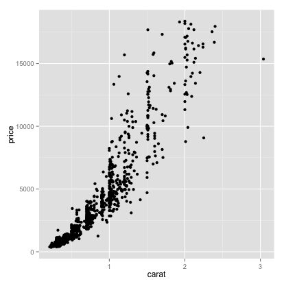
#these are equivalent:
#ggvis(x=~carat, y=~price, data=diamonds)
#ggvis(~carat, ~price, data=diamonds)
diamonds %>% ggvis(~carat, ~price)qplot() and ggvis() make it very easy to change the colour or scale aesthetics to display information about additional variables.
qplot(carat, price, data=diamonds, colour=clarity)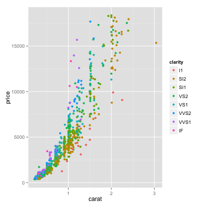
diamonds %>% ggvis(~carat, ~price, fill=~clarity)A legend is automatically corrected, with the colours of the points mapping to the clarity as we want. We would have to do a lot more work to create this plot with base graphics.
To reduce overplotting (clutter), sometimes it helps to add transparency. This specified by the alpha field in ggplot2 and opacity in ggvis. Specifying this as 1/2 means that 2 points need to overlay to achieve an opacity of one (transparency of zero).
qplot(carat, price, data=diamonds, colour=clarity, alpha=I(1/2))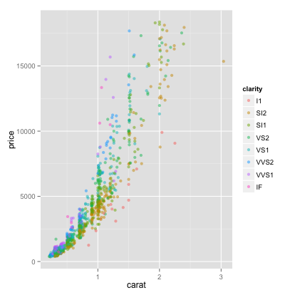
diamonds %>% ggvis(~carat, ~price, fill=~clarity) %>% layer_points(opacity:=1/2)This visualization suggests that price depends on carat through a power law which is different for every level of clarity. We can use a log-log plot to see this more clearly.
qplot and ggvis both accept transformations of variables in their arguments.
qplot(log(carat), log(price), data=diamonds, colour=clarity)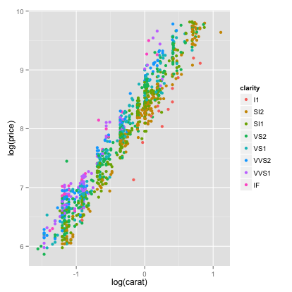
diamonds %>% ggvis(~log(carat), ~log(price), fill=~clarity)Next, we will explore how we can use colour and scale to visualize some regression diagnostics. We will use some synthetic data on height and weight for 15 individuals:
cat("
   height weight health
1  0.6008 0.3355  1.280
2  0.9440 0.6890  1.208
3  0.6150 0.6980  1.036
4  1.2340 0.7617  1.395
5  0.7870 0.8910  0.912
6  0.9150 0.9330  1.175
7  1.0490 0.9430  1.237
8  1.1840 1.0060  1.048
9  0.7370 1.0200  1.003
10 1.0770 1.2150  0.943
11 1.1280 1.2230  0.912
12 1.5000 1.2360  1.311
13 1.5310 1.3530  1.411
14 1.1500 1.3770  0.603
15 1.9340 2.0734  1.073 ",
file='height_weight.dat')

hw <- read.table('height_weight.dat', header=T)

head(hw)
## height weight health
## 1 0.6008 0.3355 1.280
## 2 0.9440 0.6890 1.208
## 3 0.6150 0.6980 1.036
## 4 1.2340 0.7617 1.395
## 5 0.7870 0.8910 0.912
## 6 0.9150 0.9330 1.175
We can visualize all the data on one plot by plotting health against weight, and scaling each point by the height:
qplot(x=weight, y=health, data=hw, size=height, colour=I("steelblue"))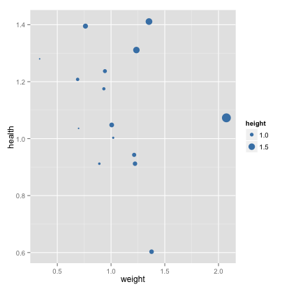
hw %>% ggvis(~weight, ~health, size=~height, fill:="steelblue")This plot is simpler than a full 3d visualization, but it of course carries less information. In particular, we can’t see the regression plane.
Let’s consider the marginal regression of health on weight. We can easily generate a scatter plot showing the line of best fit and the 95% confidence intervals:
qplot(x=weight, y=health, data=hw) + geom_smooth(method=lm)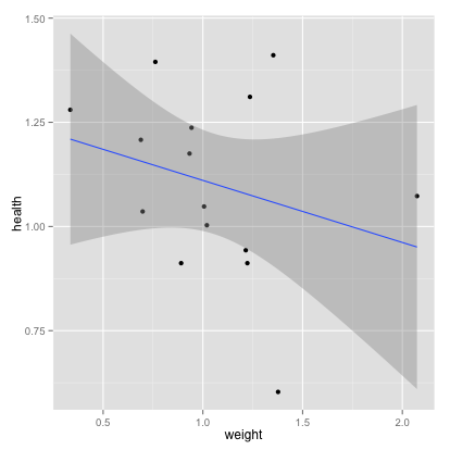
hw %>% ggvis(~weight, ~health) %>% layer_points() %>% layer_model_predictions(model='lm', se=TRUE)We can display the data, residuals and the leverage for the regression all on one plot:
fit <- lm(health~weight, data=hw)
hii <- hatvalues(fit) #leverages
res <- fit$res #residuals

qplot(x=weight, y=health, data=hw, size=hii, colour=abs(res)) +
  geom_abline(intercept=fit$coeff[1], slope=fit$coeff[2]) #regression line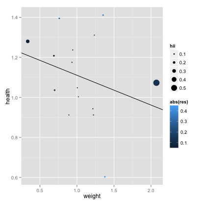
fit <- lm(health~weight, data=hw)
hii <- hatvalues(fit) #leverages
res <- fit$res #residuals
data.frame(hw, leverage=hii, residual=res) %>%
  ggvis(~weight, ~health) %>%
  layer_points(size=~leverage, fill=~abs(residual)) %>%
  layer_model_predictions(model='lm') %>%
  # This is needed because ggvis does not automatically prevent legends from overplotting
  # This will be fixed in future releases
add_legend("size", properties = legend_props(legend = list(y = 100)))We see clearly how the leverage changes as only a function of the x-values (their z-scores, to be exact). The plot makes it easy to pick out the different types of outliers. We see two points with a very high leverage but small residual - type III outliers.
Advanced use
Working with ggplot
Components of a ggplot2 plot:
data: Data framegeoms: Geometric Objectsaes: Mapping between variables (data) and aesthetics (visual properties ofgeoms)stat: Statistical Transformation
Components of a ggvis plot:
data: Data framelayer: Layers of plot componentsmappings: Mapping between variables (data) and aesthetics (visual properties ofgeoms)~assignments are equivalent toaesmappings in ggplot2.
Unlike ggplot2 ggvis does not have a separate function, you use ggvis() is analogous to both qplot() and ggplot().
p <- ggplot(data=diamonds, aes(x=carat,y=price,colour=cut)) #init. plot, specifying data and aes
p <- p + layer(geom="point") # add a layer with points geom
p #render plot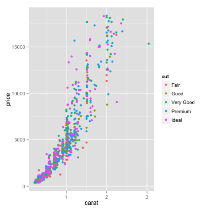
p <- ggvis(diamonds, x=~carat, y=~price, fill=~cut)
p <- p %>% layer_points()
p #render plotFor a more complicated exam, we can produce a histogram, explicitly specifying the geometry, its colour properties, the statistical transformation (binning) and its bin width property:
p <- ggplot(diamonds, aes(x=carat)) #init
p <- p + layer(
  geom="bar",
  geom_params=list(fill="steelblue"),
  stat="bin",
  stat_params=list(binwidth=.25)
)
p #render the plot
p <- ggvis(diamonds, x=~carat)
p <- p %>% layer_histograms(fill:="steelblue", binwidth=.25)
pThere is as default stat for every geom and vice versa. If we are working with defaults, we only need to specify the geom or stat, not both.
ggvis simplifies things and does not have the same stat and geom separation.
#specify the geom, using default stat
ggplot(diamonds, aes(x=carat)) + geom_histogram(binwidth=.25, fill="steelblue")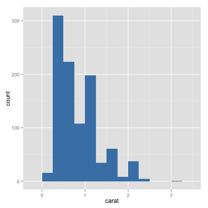
#specify the stat, using default geom
ggplot(diamonds, aes(x=carat)) + stat_bin(binwidth=.25, fill="steelblue") + geom_density()
diamonds %>% ggvis(~carat) %>% layer_histograms(binwidth=.25, fill:="steelblue")Note that in both ggplot2 and ggvis the data is copied into the plot object, not just stored as a reference. This means that we can save the plot object and load it into another workspace, and it will have all the information necessary to produce the plot.
More on Aesthetic mappings
In ggplot2 the function aes describes the mapping between variables and aesthetics (things we see in the plot). We can specify the aesthetic mappings, or update them later. In ggvis the same effect can be done by using ~ in your assignments. We will explore these bindings using our height-weight data:
p2 <- ggplot(data=hw) #initialize

p2 <- p2 + aes(x=height, y=health) #specify a mapping
p2 + geom_point() #render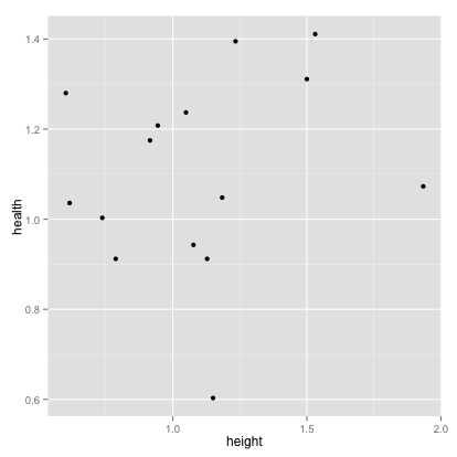
p2 <- p2 + aes(x=weight, y=health) #change mapping
p2 + geom_point() 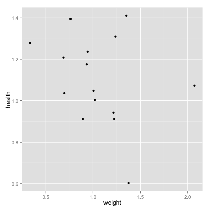
#add another aesthetic (colour)
p2 + geom_point(aes(colour=height)) 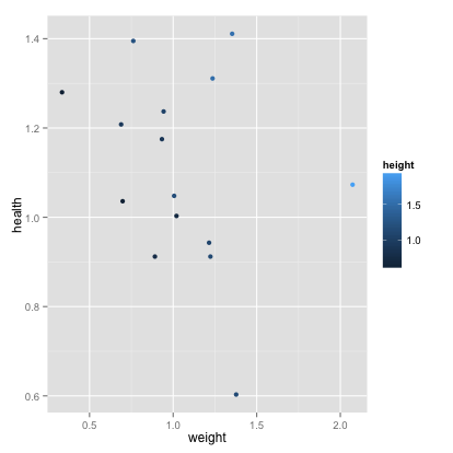
#we can also remove aesthetics
p2 + geom_point(aes(colour=NULL)) 
#instead of mapping aesthetics to a variable, we can set them to a constant
p2 + geom_point(colour="darkblue") #set col to darkblue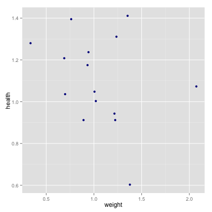
#This is different from an aesthetic mapping:
p2 + geom_point(aes(colour="darkblue"))  #create a new variable called "darkblue", and map it to color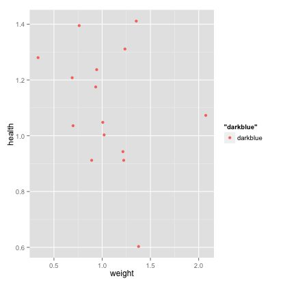
p2 <- hw

p2 <- hw %>% ggvis() %>% add_props(x=~height, y=~health)
p2 #renderp2 <- p2 %>% add_props(x=~weight, y=~health) # change mapping
p2#add another aesthetic (colour)
p2 %>% layer_points(fill=~height)#there is not currently a way to remove a mapping
#instead of mapping aesthetics to a variable, we can set them to a constant
p2 %>% layer_points(fill:="darkblue") #set col to darkblue#incorrectly mapping an aesthetic to a scalar is not possible in ggvis.Examples of plots
Categorical Data Analysis
We will now explore some examples of visualizations of categorical data. We will use the arrests dataset from the effects package, which contains demographic data on 5226 and information on whether they were arrested or released with summons for possession of marijuana. First, we experiment with some basic bar graphs:
data(package='effects', 'Arrests')

head(Arrests)
## released colour year age sex employed citizen checks
## 1 Yes White 2002 21 Male Yes Yes 3
## 2 No Black 1999 17 Male Yes Yes 3
## 3 Yes White 2000 24 Male Yes Yes 3
## 4 No Black 2000 46 Male Yes Yes 1
## 5 Yes Black 1999 27 Female Yes Yes 1
## 6 Yes Black 1998 16 Female Yes Yes 0
dat <- data.frame(colour= factor(c("Black", "White"), levels=c("Black","White")), Percent_Released = c(0.74, 0.85))

# basic bar graph
ggplot(dat, aes(x=colour, y=Percent_Released)) + geom_bar(stat="identity")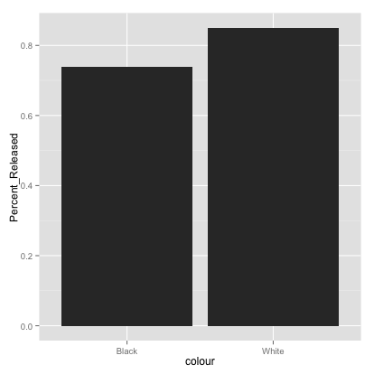
# Fill different fill colors.
ggplot(dat, aes(x=colour, y=Percent_Released)) + geom_bar(aes(fill=colour), stat="identity")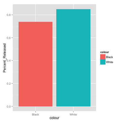
# Add a black outline
ggplot(dat, aes(x=colour, y=Percent_Released, fill=colour)) + geom_bar(colour="black", stat="identity")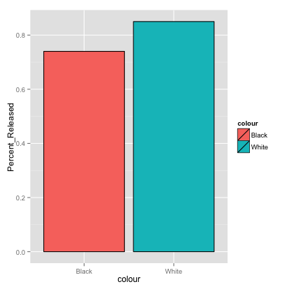
# Removing the legend
ggplot(dat, aes(x=colour, y=Percent_Released, fill=colour)) +
 geom_bar(colour="black", stat="identity") +
 guides(fill=FALSE)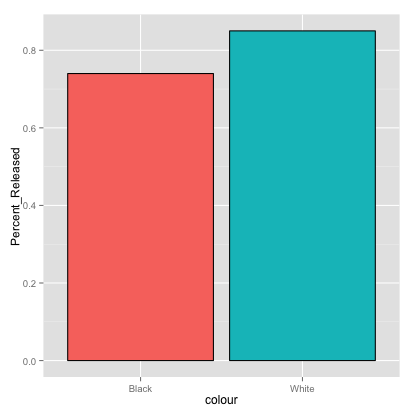
data(package='effects', 'Arrests')

head(Arrests)
## released colour year age sex employed citizen checks
## 1 Yes White 2002 21 Male Yes Yes 3
## 2 No Black 1999 17 Male Yes Yes 3
## 3 Yes White 2000 24 Male Yes Yes 3
## 4 No Black 2000 46 Male Yes Yes 1
## 5 Yes Black 1999 27 Female Yes Yes 1
## 6 Yes Black 1998 16 Female Yes Yes 0
dat <- data.frame(count=c(1L,2L), colour=c("Black", "White"), Percent_Released = c(0.74, 0.85))

# basic bar graph
dat %>% ggvis(x=~count, y=~Percent_Released) %>% layer_bars()# Fill different fill colors.
dat %>%
ggvis(x=~count, y=~Percent_Released, fill:=~colour) %>%
group_by(colour) %>%
layer_bars()# ggvis has a black outline by default
# Removing the legend broken right now, see issue #229
dat %>% group_by(colour) %>%
ggvis(x=~count, y=~Percent_Released, fill=~colour) %>%
layer_bars() %>%
hide_legend("fill")We can use an overlaid histogram to visualize more dimensions:
# Overlaid histograms
ggplot(Arrests, aes(x=checks, fill=released)) + geom_histogram(binwidth=1, alpha=.5, position="identity")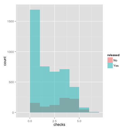
# conclusions from this plot: if you have more checks, you are much less likely to be released# Overlaid histograms
Arrests %>%
group_by(released) %>%
ggvis(x=~checks, fill=~released) %>%
layer_histograms(opacity:=1/2, stack=FALSE)Next, we can generate different kinds of box plots. Note ggvis cannot do faceting yet.
#specify the theme
p <- ggplot(data=Arrests) + theme(plot.title=element_text(lineheight=.8, face="bold"))

p + geom_boxplot(mapping=aes(x=colour, y=unclass(checks))) + ggtitle("Prior Police Checks by Race") 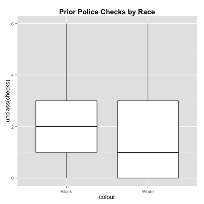
p + geom_boxplot(mapping=aes(x=released, y=unclass(checks))) + ggtitle("Prior Police Checks by Released (Yes/No)")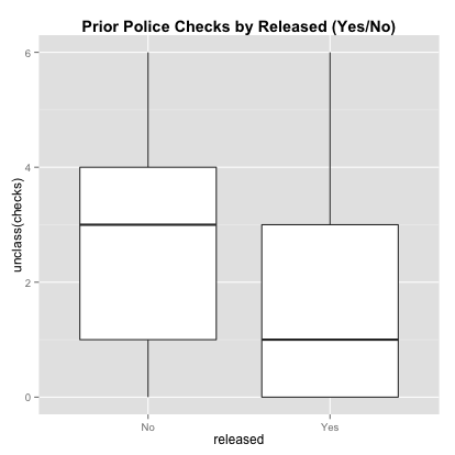
# faceting
p + facet_wrap(~released) +
  geom_boxplot(mapping=aes(x=colour, y=unclass(checks), color=colour)) +
  ggtitle("Prior Police Checks by Race and Released (Yes/No)")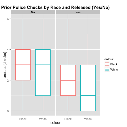
#specify the theme
Arrests %>% ggvis(x=~colour, y=~checks) %>% layer_boxplots()Arrests %>% ggvis(x=~released, y=~checks) %>% layer_boxplots()Density Estimation
Generating histograms and nonparametric density estimates is easy with ggplot2 and ggvis. Here are some examples taken from the R Cookbook by Winston Chang:
# Basic histogram from the vector "rating". Each bin is .5 wide.

df <- data.frame(cond = factor( rep(c("A","B"), each=200) ), rating = c(rnorm(200),rnorm(200, mean=.5)))
###simulate data from mixed dist. 0.5N(0,1) + 0.5N(0.5,1)

ggplot(df, aes(x=rating)) + geom_histogram(binwidth=.5)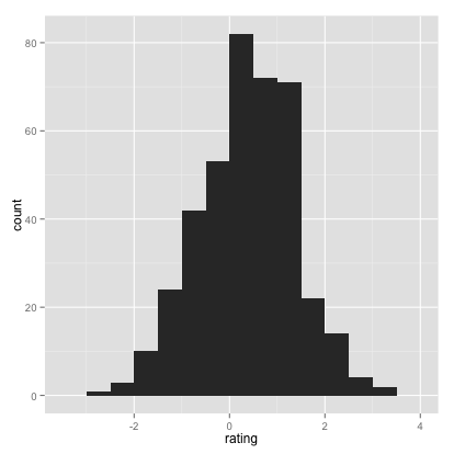
# Draw with black outline, white fill
ggplot(df, aes(x=rating)) + geom_histogram(binwidth=.5, colour="black", fill="white")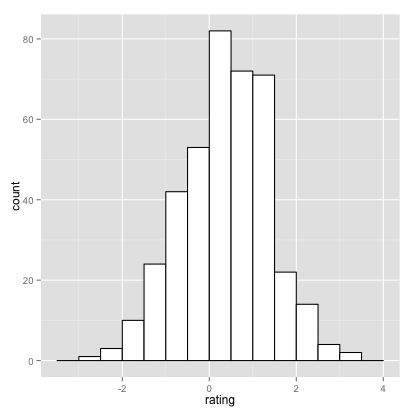
# Density curve
ggplot(df, aes(x=rating)) + geom_density()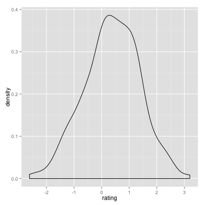
# Histogram overlaid with kernel density curve
ggplot(df, aes(x=rating)) + geom_histogram(aes(y=..density..),
# Histogram with density instead of count on y-axis
binwidth=.5,
colour="black", fill="white") +
geom_density(alpha=.2, fill="pink")  # Overlay with transparent density plot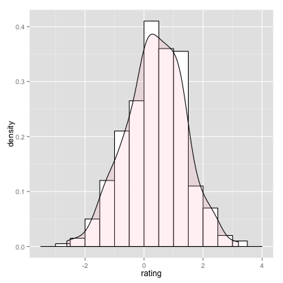
# Basic histogram from the vector "rating". Each bin is .5 wide.

df <- data.frame(cond = factor( rep(c("A","B"), each=200) ), rating = c(rnorm(200),rnorm(200, mean=.5)))
###simulate data from mixed dist. 0.5N(0,1) + 0.5N(0.5,1)

df %>% ggvis(x=~rating) %>% layer_histograms(binwidth=.5)# Draw with black outline, white fill
df %>% ggvis(x=~rating) %>% layer_histograms(binwidth=.5, fill:="white")# Density curve
df %>% ggvis(x=~rating) %>% layer_densities()# It is not currently possible to have a density and histogram on the same plot using ggvisConclusion
We hope that this short tutorial gave you a sense of how ggplot2 and ggvis function as powerful and flexible visualization packages, and how to convert between them.
If you liked this tutorial also see plyrToDplyr.
Original ggplot2 Tutorial by Alex Yakubovich, Cathia Badiere and Wei-Hao Hwang
Author: Jim Hester
Created: 2014 Jul 30 12:23:19 PM
Last Modified: 2014 Sep 18 03:16:24 PM

Styled with knitrBootstrap